20 UGC Ad Examples That Actually Converted (And Why)
Twenty UGC ad examples broken down frame by frame — the hook, the structure, and the specific reason each one worked. Steal the patterns, not the scripts.
Most 'best UGC ads' roundups are screenshots with adjectives. This one is a pattern library: twenty ad structures that consistently convert, each with the mechanism that makes it work. Copy the mechanism, not the script — a hook that worked for a skincare brand rarely survives being transplanted word-for-word onto a B2B tool, but the *reason* it worked usually does.
Examples are grouped by the job they do in the funnel. For the strategic frame around all of this, see the UGC ads playbook.
Top of funnel: earning the first two seconds
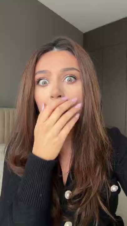
1. The reaction hook + hard cut
Structure: 2s of a genuine shocked face, caption 'Wait, it does this automatically?', hard cut to the app auto-sorting a messy inbox. Mechanism: the face is a pre-conscious pattern interrupt; the caption converts raw emotion into a specific claim; the demo starts paying it off at second 3, before skepticism arrives. Why it generalizes: works for any product with a single visually obvious 'wow' moment.
2. The skeptic's open
Structure: arms crossed, side-eye, 'I really wanted this to fail.' Mechanism: acknowledges the viewer's doubt before the viewer can act on it. Openers that agree with the doubter convert doubters; enthusiasm at frame one only converts the already-convinced.
3. The result-first
Structure: phone screen showing 243k views, filmed over a shoulder, caption 'one hook did this,' whip cut to the hook itself. Mechanism: undeniable visual outcome plus an open loop ('*which* hook?') that only watching closes. Requires: a genuinely striking number. A mediocre result shown first is worse than teasing it.
4. The price shock
Structure: 'I was paying $250 a clip for this' → demo → 'this was one payment.' Mechanism: anchors high, reveals low, and lets a disbelieving expression sell the gap. Price is the objection everyone already has, so leading with it is pre-emptive.
5. The mid-action start
Structure: begins mid-sentence, mid-unboxing, mid-mistake. No setup. Mechanism: the missing beginning *is* the open loop — arriving late to something feels more compelling than being welcomed at the door.
6. The warning
Structure: 'Stop doing this immediately' + a common mistake acted out. Mechanism: loss aversion outperforms gain seeking, especially on cold traffic. Caveat: the payoff must genuinely deliver on the warning or you get an exit that the algorithm reads as a quality verdict on the whole ad.
7. The POV skit
Structure: 'POV: you finally found the app your accountant uses.' Scene plays out, product appears inside the story. Mechanism: native TikTok grammar — it doesn't resemble an ad at any frame, which makes it uniquely resistant to skip reflexes.
Mid funnel: answering 'is this actually good?'
8. The honest testimonial with a hedge
Structure: genuine praise, then 'it took three weeks, not three days.' Mechanism: the hedge is what makes the praise believable. Unqualified enthusiasm reads as paid; qualified enthusiasm reads as real. The single most underused move in UGC.
9. The before/after workflow
Structure: 'My Sunday used to be six hours of invoices. Watch this.' Split screen, old process vs. new. Mechanism: transformation is the shape of every purchase decision — current state to desired state, made concrete and time-stamped.
10. The founder demo
Structure: founder at a desk, phone propped up: 'I built this because I hated doing X.' Mechanism: the person who made it explaining why carries credibility no hired creator can replicate. Rough and honest beats polished and generic.
11. The comment-reply ad
Structure: screenshot of a real user question, answered on camera. Mechanism: built-in context and implied community. It proves people are already using and discussing the product without making that claim explicitly.
12. The unboxing / first-run
Structure: the reveal experienced in real time, unedited reactions kept in. For apps, the equivalent is a live-narrated first 60 seconds in the product. Mechanism: the viewer discovers alongside the creator instead of being told afterward.
13. The green-screen teardown
Structure: creator talks over screenshots, pricing pages, or competitor comparisons. Mechanism: cheap, fast, endlessly iterable, and it positions the creator as an analyst rather than a promoter.
14. The day-in-the-life integration
Structure: product appears three times across a normal day, never as the subject. Mechanism: demonstrates habitual use rather than claiming it. Especially strong for retention-dependent products.
Bottom of funnel: killing the last objection
15. The direct comparison
Structure: 'I tried the $99/month one and this one. Here's the difference.' Mechanism: the viewer is already comparison shopping — meeting them inside that process beats interrupting it.
16. The objection-named ad
Structure: opens by stating the exact hesitation — 'I thought this was another subscription trap.' Mechanism: naming the objection out loud defuses it more effectively than any counter-argument. Pull these lines directly from your support tickets and cancellation surveys.
17. The receipts ad
Structure: real dashboard, real numbers, real dates, filmed on a phone rather than screenshotted cleanly. Mechanism: the imperfect capture is the credibility. A pristine screenshot reads as marketing; a slightly crooked phone photo of a screen reads as evidence.
18. The 'still using it' follow-up
Structure: 'Three months later — do I still use it?' Mechanism: answers the durability objection that kills subscription conversions, and it's the only format that can credibly do so.
19. The niche-specific proof
Structure: same demo, but the speaker names a specific profession — 'if you're a freelance designer, this is for you.' Mechanism: specificity reads as relevance. One demo plus five niche framings often outperforms five different demos.
20. The soft-CTA close
Structure: ends with 'at least try the free tier' rather than 'sign up now.' Mechanism: giving the viewer an easy out lowers commitment anxiety and consistently outperforms hard CTAs in short-form. The push should feel like a suggestion from a friend, not a close from a salesperson.
The patterns underneath all twenty
- Frame one is a face or a number. Never a logo, never a fade, never a warm-up.
- Every ad opens a loop and closes it. The hook makes a promise; the next five seconds start visibly paying it.
- Imperfection is a credibility signal. Handheld, slightly crooked, one take with the stumble left in.
- Specific beats impressive. '$400 in unbilled hours' outperforms 'saves you money' every time.
- Hedges sell. A caveat, a limitation, an admission — each one buys trust that pure enthusiasm can't.
- One idea per ad. Two claims make zero.
Frequently asked questions
What makes a UGC ad successful?
A hook that stops the scroll in under two seconds (usually a human face or a striking number), a demo that immediately starts paying off the hook's promise, specific rather than generic claims, and enough imperfection that the ad reads as a person rather than a production.
How long should a UGC ad be?
15–20 seconds for cold-traffic install and purchase campaigns; up to 30–45 seconds for testimonials aimed at warm audiences who are already considering. Completion rate is a strong distribution signal, so shorter usually wins at the top of funnel.
Can I copy these UGC ad examples directly?
Copy the structure and mechanism, not the script. A hook that worked for skincare rarely survives transplanting word-for-word to a B2B tool, but the underlying reason it worked — loss aversion, an open loop, a credible hedge — transfers reliably.
How many UGC ads should I test at once?
At least five hook variations against a single fixed demo, run for 48–72 hours. Isolating the hook as the only variable is what makes the results interpretable.
Where do I find UGC footage for these formats?
Reaction hooks can come from licensed clip libraries with commercial rights included; testimonials and product-in-hand footage generally require commissioned creators or your own customers. Most teams blend both.