






The brief
This fictional app lets people move a task into today's plan and start a focus timer. The assignment is to explain that small workflow through three branded reaction clips. It is not to promise that users will become more productive, and it is not a report from an actual campaign.
AudiencePeople who already keep a task list but want a clearer way to choose the next action.
Feature in focusMove one task into today's plan, then start a focus timer.
The creative challenge
A feature list would make the app sound like every other planner. A generic claim such as 'take back your day' would be difficult to demonstrate. The creative needs to make a recognizable moment feel specific: a person has plenty of tasks, but choosing one is still the hard part.
How the concept comes together
1. Define the website brief
Describe the task-selection workflow on the product website before using it as the input for RE/UGC. Review the resulting brand understanding for unsupported features. Keep integrations, time savings, and automatic scheduling out of the message unless the actual product supports them.
2. Give each clip one job
Choose three messages: recognition of a crowded list, clarity about selecting one task, and an invitation to start a timer. Use the same AI creator for an initial comparison so the message is the main difference. A later batch can explore curious and relieved expressions.
3. Keep the demo separate
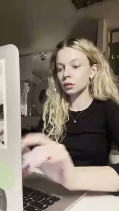
The branded reaction clips contain the on-screen message, not a generated interface recording. If the creative needs a product demonstration, capture a sample task moving into today's plan and add it after the reaction in an external editor. Do not suggest the AI character personally used the planner.
The proposed three-clip batch
Sample on-screen copy for this fictional brief. These are not published ads or customer quotes.
A long list. One clear next step.
Curious reaction. Starts with the planning problem without overstating a result.
Choose one task before opening another tab.
Curious reaction. Makes the decision concrete while keeping the same creator setup.
Pick a task. Start the timer. Begin there.
Curious reaction. Names the feature sequence directly.
Review and export
The proposed batch contains three messages for one workflow. Review every caption, check line breaks on a phone, and export with text enabled. Music can stay off for a quieter version. Choose the repeat count after checking reading time; repeating a clip is not a substitute for trimming an overlong message.
How to evaluate the batch
Before publishing, define what each angle is meant to test. Compare the clips using the same audience, destination, and observation window. Review visits alongside task creation or timer starts. No campaign has been run for this example, so there are no measured improvements to report.
The takeaway
A productivity-app brief becomes easier to turn into creative when it names one action. The reusable idea is the task-selection moment, not an unverified claim about how much time the app saves.